Course
This lesson is part of a course that teaches you how to build a New Relic application from the ground up. If you haven't already, check out the course introduction.
Each lesson in the course builds upon the last, so make sure you've completed the last lesson, Add user interface components to your application, before starting this one.
In previous hands-on lessons, you created all the charts from your design guide. Unfortunately, they aren’t laid out like they are in the design. The New Relic One SDK provides multiple solutions for organizing your components. The one you’ll learn about in this lesson is the Grid component.
To arrange your charts, place them in a Grid. A Grid is a container you use to organize your content into 12-column rows. A GridItem is the building block for a Grid. You specify the columnSpan of a GridItem between 1 and 12 to determine how much of the row that the GridItem should cover. So, if you want a chart to stretch across the width of the view, you would place the chart in a GridItem with a columnSpan of 12. If you want twelve charts to fit in a single row, use a columnSpan of 1.
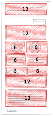
Using the design guide as a base, you can plan how to organize your Grid:

Once you’ve planned out how you’re going to arrange your columns, you can write some code to realize your plans.
Change to the add-a-grid/ab-test directory of the coursework repository:
$cd nru-programmability-course/add-a-grid/ab-testIn your Nerdlet's index.js file, import Grid and GridItem. Then, update your Nerdlet's render() method by placing each chart in a GrildItem. Finally, place all your items in a Grid:
import React from 'react';import { ChartGroup, Grid, GridItem } from 'nr1';import NewsletterSignups from './newsletter-signups';import PastTests from './past-tests';import TotalCancellations from './total-cancellations';import TotalSubscriptions from './total-subscriptions';import VersionPageViews from './page-views';import VersionTotals from './totals';
export default class AbTestNerdletNerdlet extends React.Component { render() { return <div> <Grid className="wrapper"> <GridItem columnSpan={12}><NewsletterSignups /></GridItem> <GridItem columnSpan={6}><TotalSubscriptions /></GridItem> <GridItem columnSpan={6}><TotalCancellations /></GridItem> <GridItem columnSpan={6}><VersionTotals version='a' /></GridItem> <GridItem columnSpan={6}><VersionTotals version='b' /></GridItem> <ChartGroup> <GridItem columnSpan={6}> <VersionPageViews version='a' /> </GridItem> <GridItem columnSpan={6}> <VersionPageViews version='b' /> </GridItem> </ChartGroup> <GridItem columnSpan={12}><PastTests /></GridItem> </Grid> </div> }}The columnSpan for each chart matches the layout plan. Every chart that takes up half the 12-column row has a columnSpan of 6, and every chart that takes up the whole row has a columnSpan of 12. Notice that each of the charts in the ChartGroup, but not the ChartGroup itself, is in a GridItem. A ChartGroup connects charts' behaviors, not their locations.
Each chart fills its columnSpan because they use the fullWidth prop. fullWidth makes the chart fill its available horizontal space and GridItem.columnSpan restricts that space to some fraction of the row. Remove a fullWidth prop, and see how the chart reacts.
Technical detail
Notice the wrapper class applied to the Grid. We quietly provided some CSS styles to help make this app look great! This isn't a CSS course, so we won't cover everything we added, we'll just include the styles we intend for you to use in the code snippets. Just know that every UI component in the New Relic One SDK provides a className prop where you can provide a CSS class name.
You can view the styles in nerdlets/ab-test-nerdlet/styles.scss.
Navigate to the root of your Nerdpack at nru-programmability-course/add-a-grid/ab-test.
Generate a new UUID for your Nerdpack:
$nr1 nerdpack:uuid -gfBecause you cloned the coursework repository that contained an existing Nerdpack, you need to generate your own unique identifier. This UUID maps your Nerdpack to your New Relic account.
View your changes in New Relic:

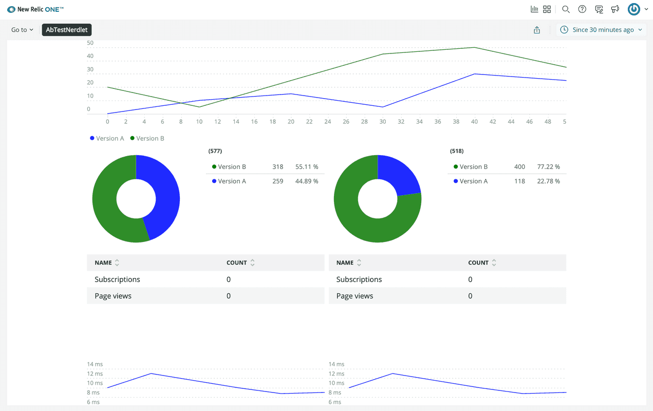
Here, you see your charts styled and arranged in a grid.
When you're finished, stop serving your New Relic application by pressing CTRL+C in your local server's terminal window.
In just six steps, you significantly improved the readability and usability of your A/B test application, but you can take further steps to improve the usability of your charts. In the next lesson, you’ll add headings to your charts to remind yourself of what data each chart presents.
Course
This lesson is part of a course that teaches you how to build a New Relic application from the ground up. When you're ready, continue on to the next lesson: Add chart headings.